Our existing clients SO NICE & PUMA, who build official shopping website on my company's SaaS platform, want to let consumers check the store inventory on the website. This is a customized project and only 2 stores have the feature.
Based on the findings of competitor analysis, deliver a standardized product solution that fits seamlessly with the requirements of both SO NICE and PUMA.
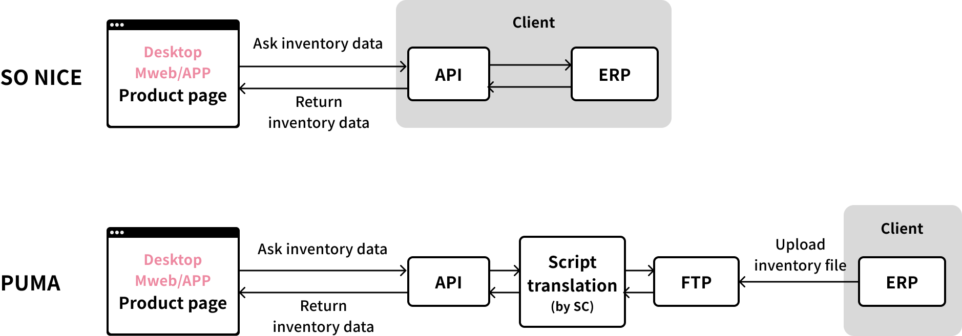
Relevant inventory data will be provided through APIs from the client's ERP system.
SO NICE: Integration with ERP via APIs.
PUMA: File transfer via FTP, Our Solution Engineer will convert FTP files into standard API format.

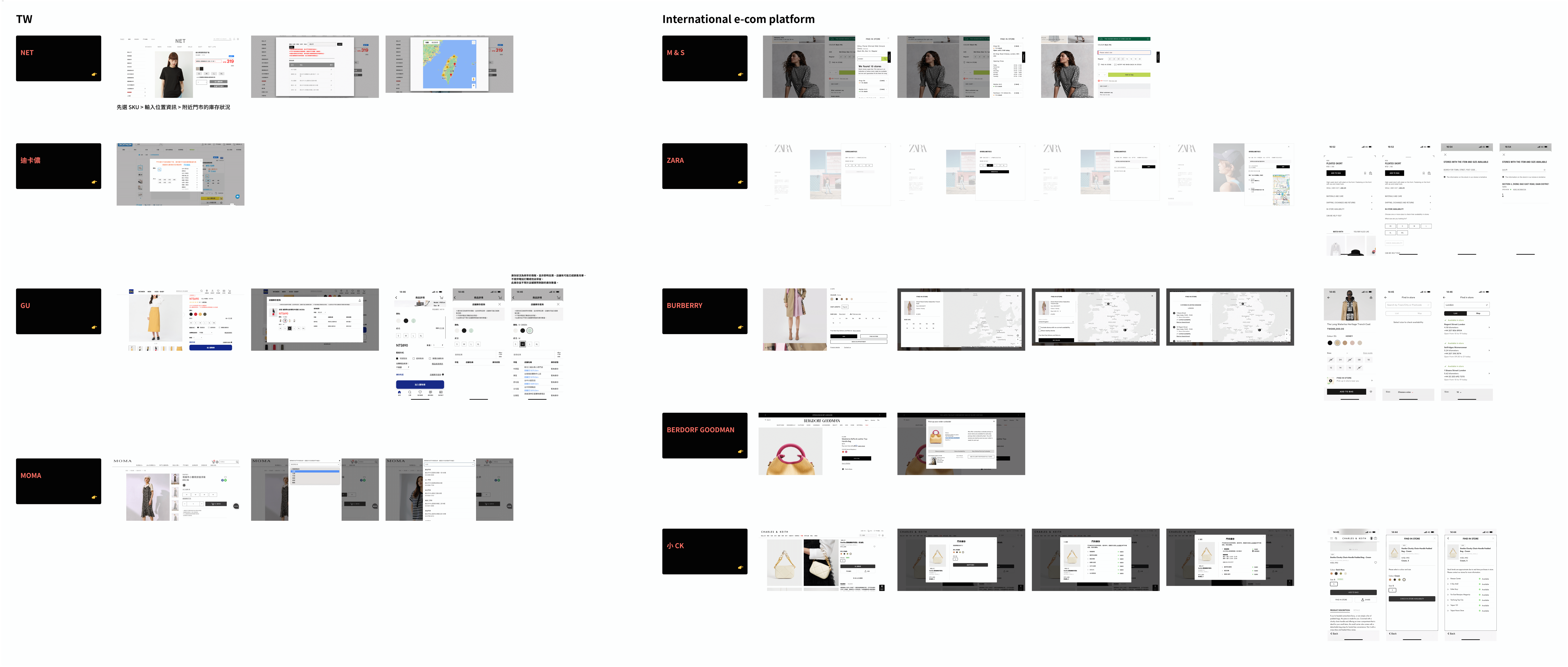
Referring to the findings on both TW and international e-commerce platforms, the typical approach for designing an in-store inventory process involves:
1. Displaying an in-store inventory button on the product page
2. Upon clicking, a stock inquiry pop-up emerges, allowing users to query the availability of specific attributes like color and size for a particular SKU at different store locations.


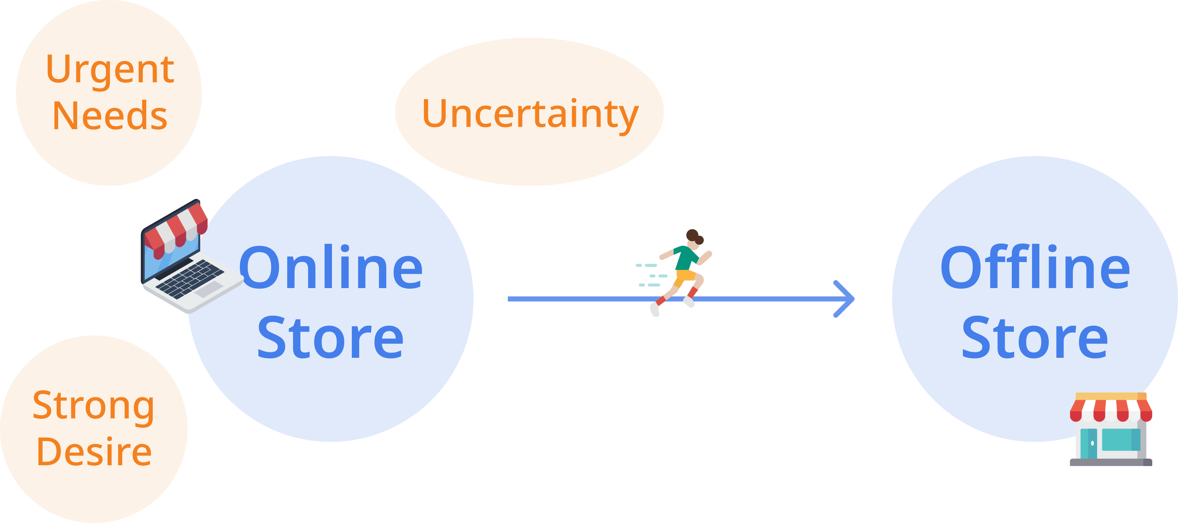
Motivation: Urgent Needs, Strong Desire, Uncertainty
1. Logistic shipping takes too long, so consumers visit the store to buy the product. (Fast-moving consumer goods, e.g., T&T)
2. While browsing the website, consumers get really excited about a product and want to get it immediately.
3. Unsure about the size, so consumers go to the store to try on. (Clothes & shoes, e.g., LEVIS)
4. To examine the product if the quality matches the price. (High-end products)

Design points
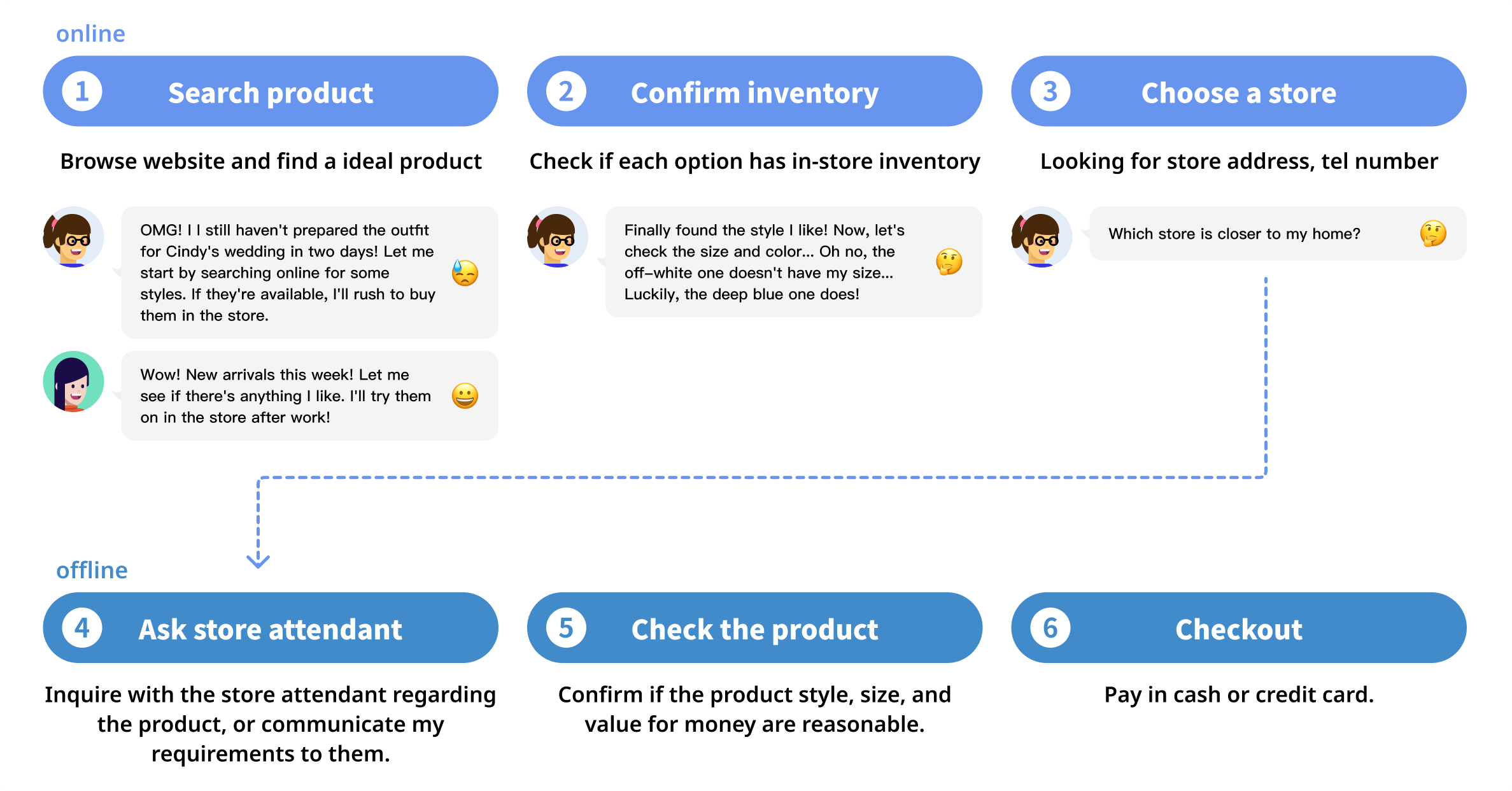
✦ The user story is, As a consumer, when the online store is out of stock, I intend to visit a real store for purchase. Hence, I would like to check the inventory in advance.
✦ I didn’t strongly emphasize the entrance button UI. Since "Find in store" is one of the side tasks, "Online shopping" is the main task.
✦ Placed the "Find in store" option below the checkout button. When the checkout button indicates that the SKU is out of stock, consumers can then proceed to click the in-store inventory.
[Desktop] Prototype
[Mobile] Prototype
Overview and Objective
The A/B test aimed to increase user bookings, lesson attendance, and purchases by introducing a new onboarding flow that included a welcome screen, learning goal, and hobbies questionnaire.
Key Findings
✦ No statistically significant improvements were observed in key metrics (bookings, attendance, or purchases).
✦ A statistically significant 29% decrease in users reaching the quickbooking portion of the flow was noted, likely due to additional steps in the onboarding process.
Behavioral Insights
✦ Users who completed the additional onboarding steps showed higher engagement and were more likely to attend booked lessons, indicating that the new flow filtered out less motivated users.
✦ The test group had a higher lesson attendance rate (86%) compared to the control group (78%).
Conclusion
✦The test was concluded with the control flow as the default due to a lack of significant improvement in goaling metrics.
✦ The additional onboarding steps may have value for identifying and engaging more motivated users but at the cost of filtering out less engaged ones.
Recommendations
✦ Testing individual components of the new user flow could be beneficial, but the priority should shift to other experiments and projects.
✦ Consider exploring the personalization of the experience using collected data (e.g., interests or hobbies), though this would require significant effort and scoping.
✦ No immediate action to reintroduce a similar onboarding flow for Engoo.
✦ Reference the findings to address lower lesson attendance rates and explore potential improvements to the overall user experience.