Wogogo was my first startup. My role was to take care of every design-related issue of product, including UX design and UI design. The purpose of this platform was to connect tour guides and tourists. Customers could find and book a local tour guide who speaks their language and who could lead them to experience special activities or cultural life while traveling. At the time I joined this company, they had already built an app designed by a contract graphic designer. But CTO wasn’t satisfied with it. My first challenge was to renew the app.
The first step was to check every single page and flow we had. And we can see several UI screens I’ve placed here… Uh...I believe you’ll realize the reason why CTO is not satisfied with it. 🙈

▴ Sign In

▴ Home Page

▴ Select Time

▴ Guide Info

▴ Booking Form

▴ Order
After the review process, I found many problems. Such as:
I believe it’s also very important to know more about who the main target user is. After that, I came to the marketing department and learned some details about users through a market survey.
A medium-high income person, over 30 years old, willing to invest money in enjoying a better life.
Don’t want to attend group travel.
During private journey or business travel.
Too busy to search for information and make their travel plans.
Have a problem with language or are unsure where to go.
A personal tour guide can help by designing travel plans according to interests, and deal with matters like booking hotels, tickets, transportation, etc.
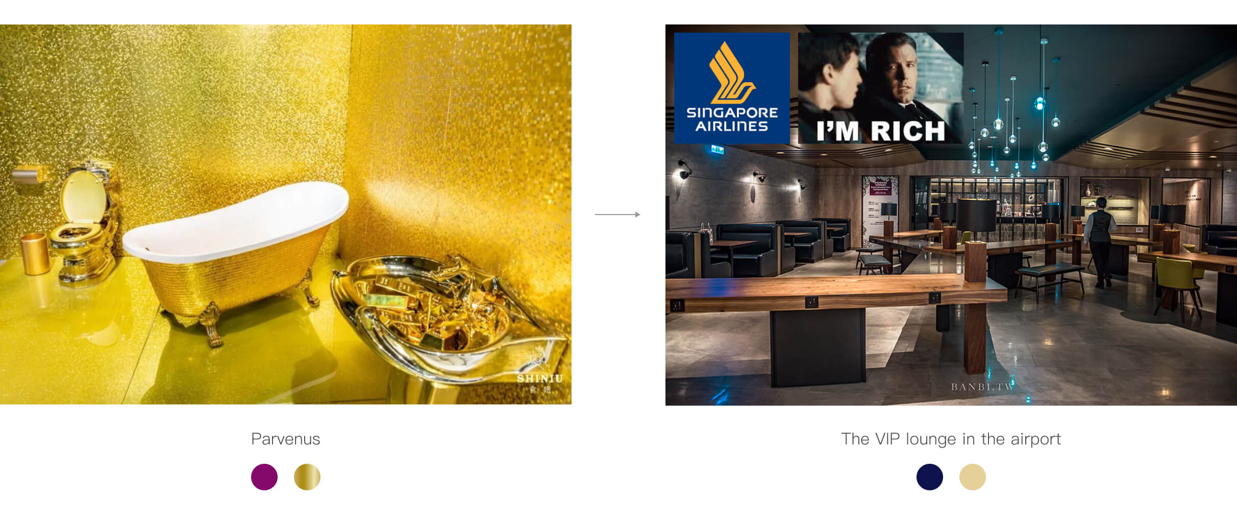
Then, after gathering all the information I needed, I began my new design. First, I cooperated with a graphic designer in the marketing department, and after negotiating many times with the CEO, we finally delivered a new branding color system. Replaced the original purple with dark blue, the new branding design used the contrast of blue and solid gold, to create a feeling of modern and understated luxury.

The next step was building a complete design system. I built the UI components and the new UI screens at the same time. It’s a way of saving time.

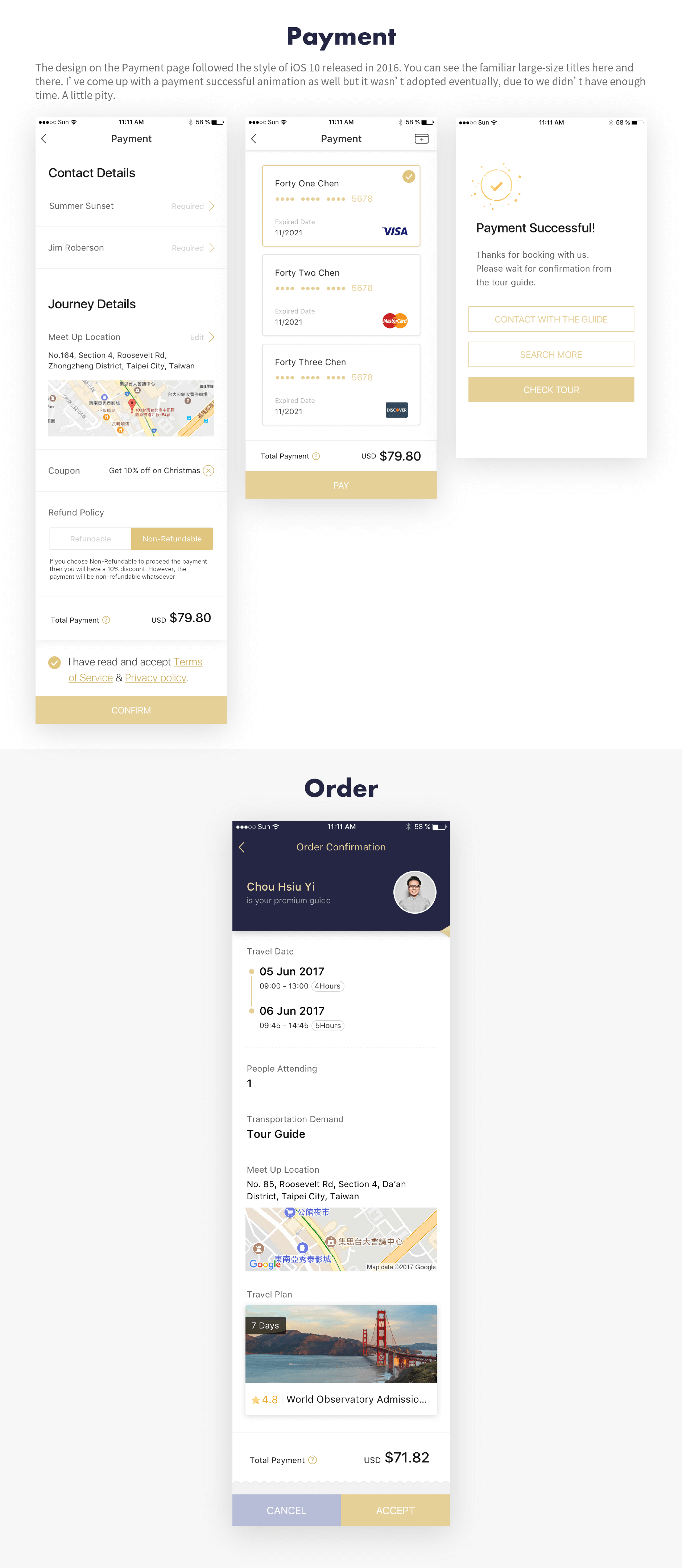
There were 5 main functions in our appliccation. I began from the most important one. After months, finally, I finished the redesign of the Search and Booking function flows. These are part of the final UI assets.
I believe most of us feel the itch to travel every time we see beautiful photos of other countries, and because of this, my design concept was to use lots of fine and well-taken pictures on the interface. I wanted to arouse people feelings of excitement and drive them to take action - press the BOOK button.


Unfortunately, wogogo went out of business after a year because of financial problems. I didn’t finish all my jobs, but still learned and matured as a result of this experience. I am happy to have had the hands-on experience of building a customer product.